Jimny Owners Group
Lifestyle
Branding
Typography
Illustration
Animation
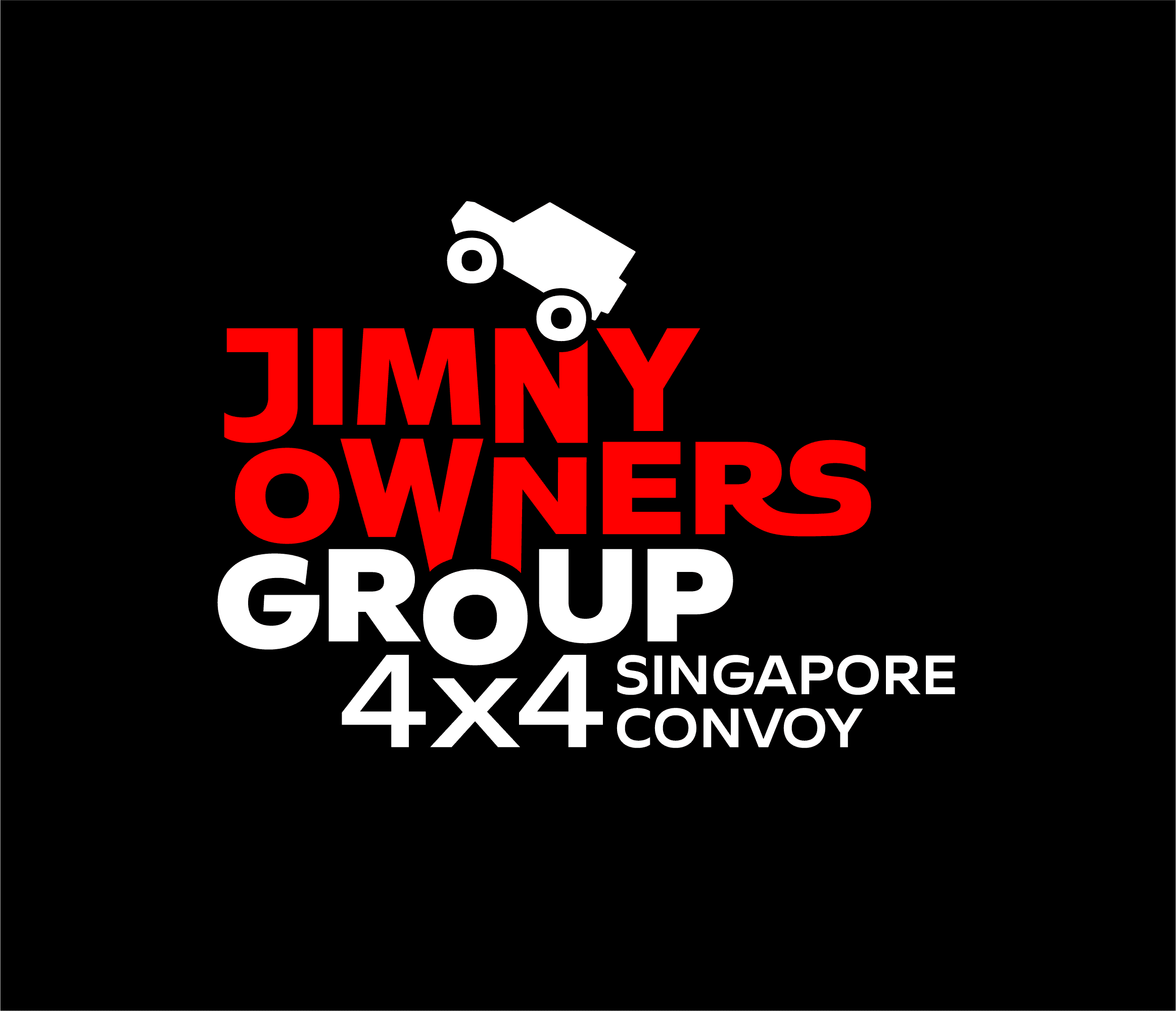
The logo for Jimny Owners Group embodies the adventurous spirit and rugged capability of the Jimny community in Singapore. The letters in the logotype are designed to reflect the uneven terrain that Jimny vehicles encounter during off-road adventures, highlighting the group’s love for exploration and challenging landscapes. The two ‘O’s in the logotype creatively represent the tires of a Jimny, emphasizing the vehicle’s robust suspension system and showcasing the smooth, capable ride even on rough terrain.


This design conveys a sense of community and connection among Jimny enthusiasts, reminding members of the shared experiences and adventures that bring them together. The logo’s cohesive and visually appealing identity resonates with the adventurous and spirited nature of the Jimny Owners Group, celebrating their passion for off-roading, their love for the Jimny vehicle, and the camaraderie that defines their meetups and adventures. Moreover, the logo is designed to appeal to all Jimny owners, whether they are extreme off-roaders or using the Jimny as a city car, making it a versatile and fitting representation for the entire community.


The Jimny Owners Group logo is designed with four levels of responsiveness, ensuring it adapts seamlessly to a variety of scenarios and use cases.


Importantly, the logo belongs to everyone from anywhere, aiming to create a sense of belonging for Jimny enthusiasts worldwide. It is versatile enough to be adopted by Jimny owners in any country, fostering a global community united by their shared love for the Jimny. [Download]


You are currently browsing http://www.bybravo.co.
Your time and attention are appreciated.
Copyright © 2010–Now & Forever.