Challenge
Shifting perceptions
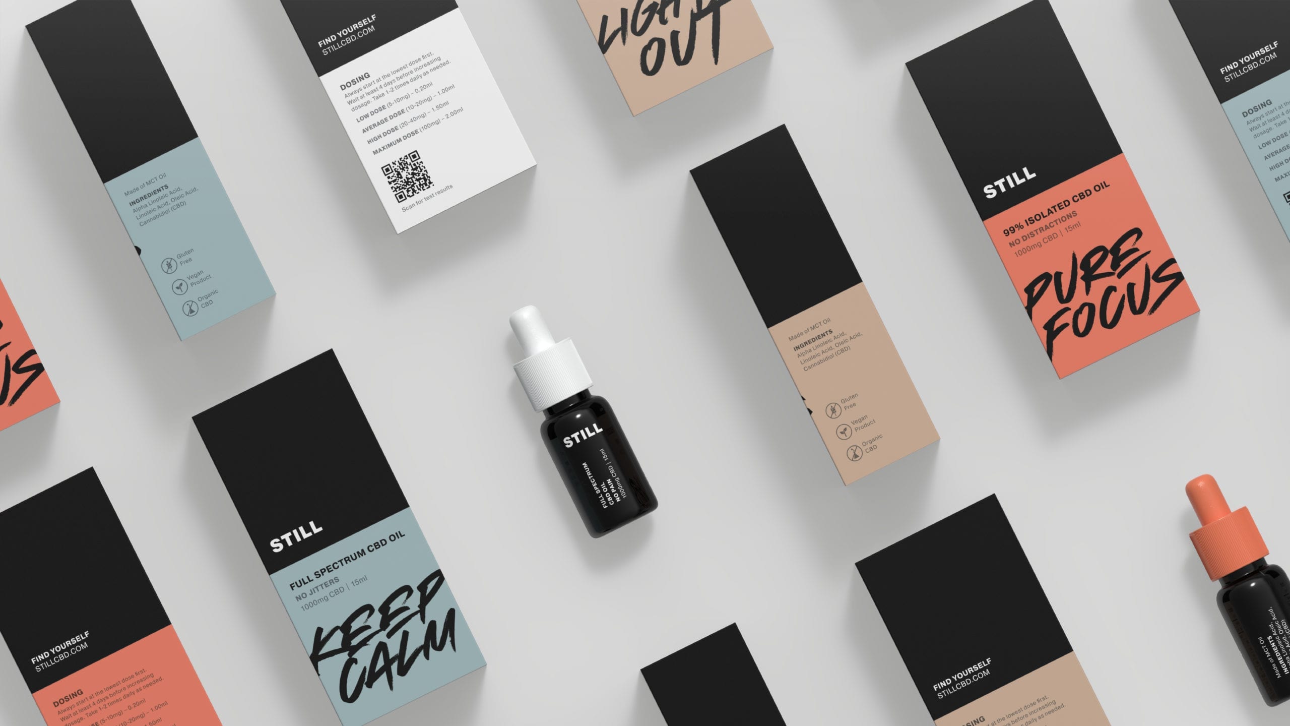
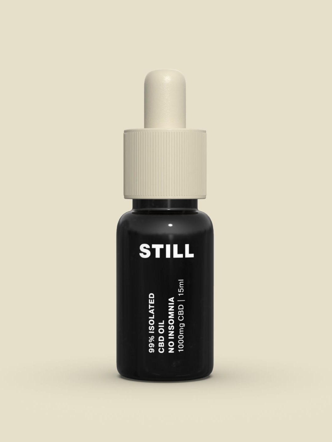
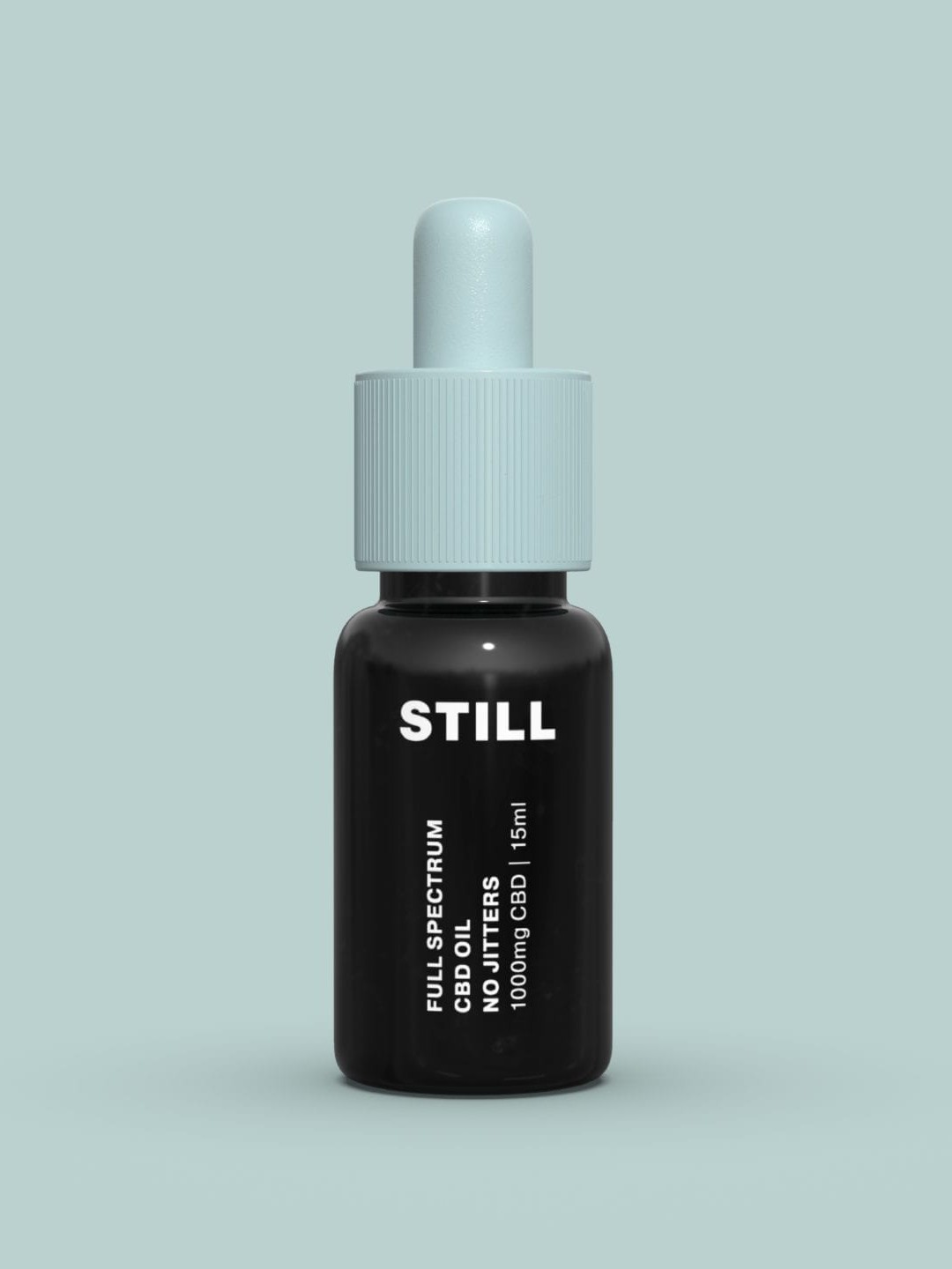
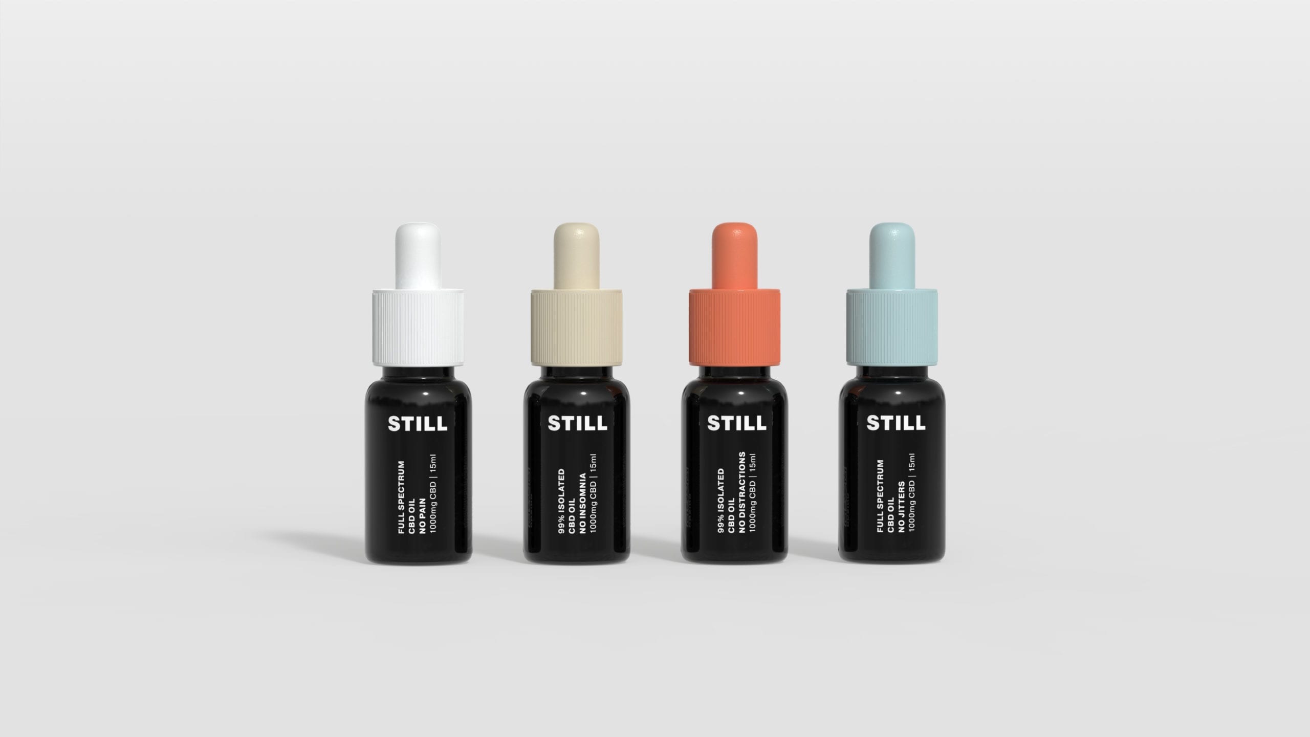
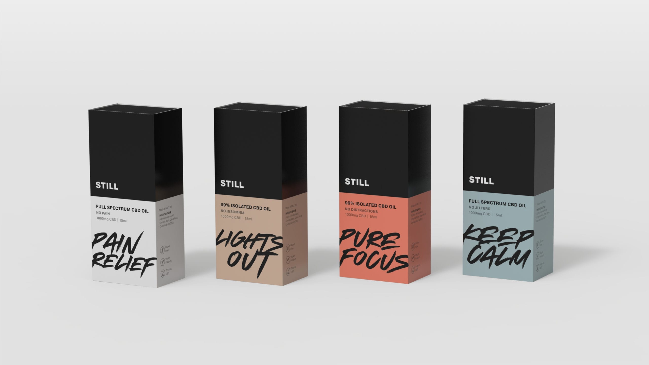
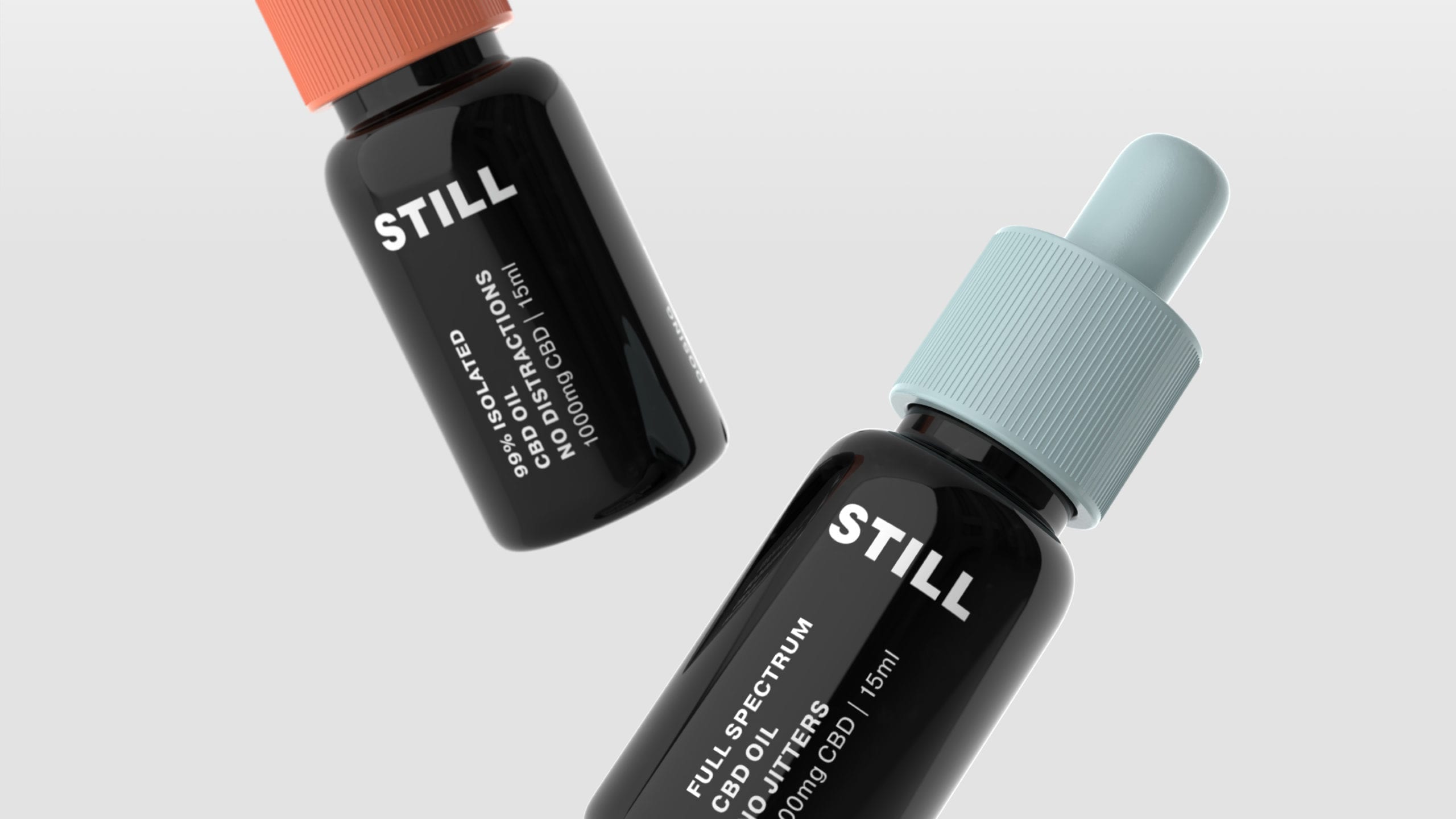
Founded in Canada, Still is a new player in the full-spectrum CBD oil market.
We were brought onboard to create the brand identity and packaging design. The challenge was to create a brand that resonates with the modern consumer, and challenging the perception of medical cannabis – an often misunderstood drug.

Process
New wellness
Working remotely from Singapore with the founders in Toronto, we set out to explore the growing CBD oil market. Quickly, two categories emerged – CBD brands that explicitly used cannabis leaves in their design, while the others tapped into the wellness trend using the colour green or spa like visual cues to symbolise the healthy benefits of CBD oil.
It became clear that we needed to take a different approach in order for Still to be positioned as a wellness alternative for hectic city lifestyles.
Solution
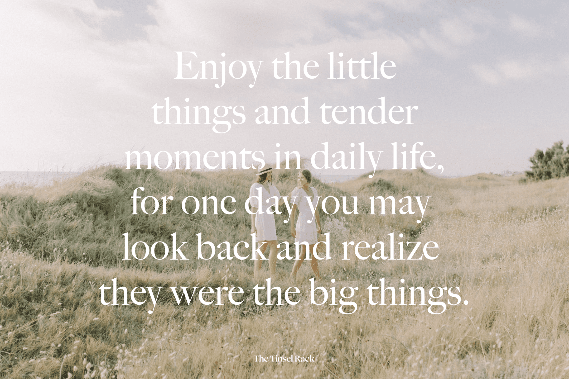
Sight of calm
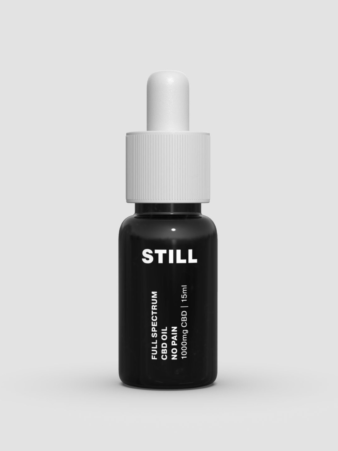
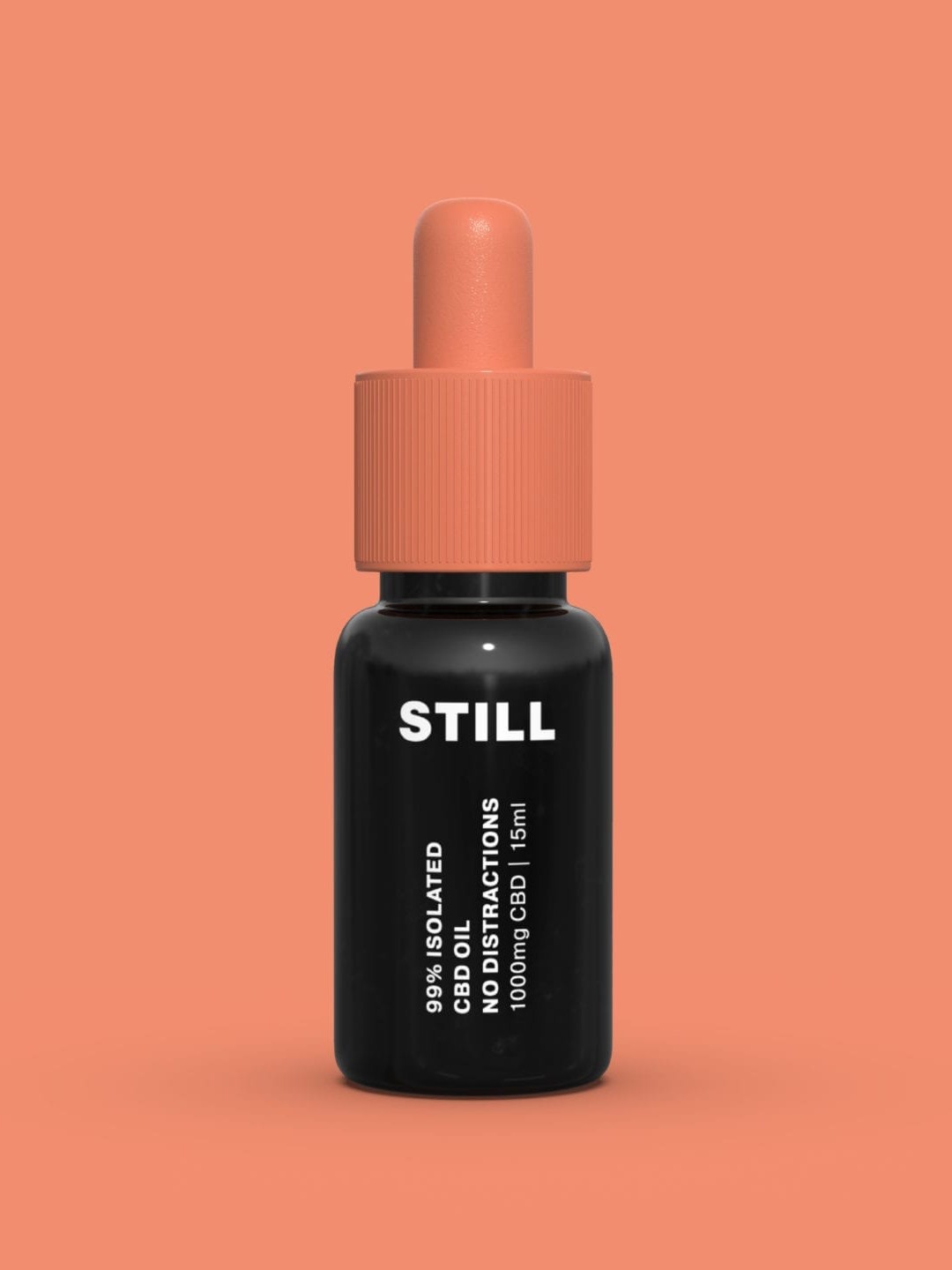
We worked closely with the Still team to develop a brand identity that reflects how CBD oil can be a supplement that brings balance to our daily lives. This gave life to the idea of a simple look and feel, cutting through the clutter of everyday life.
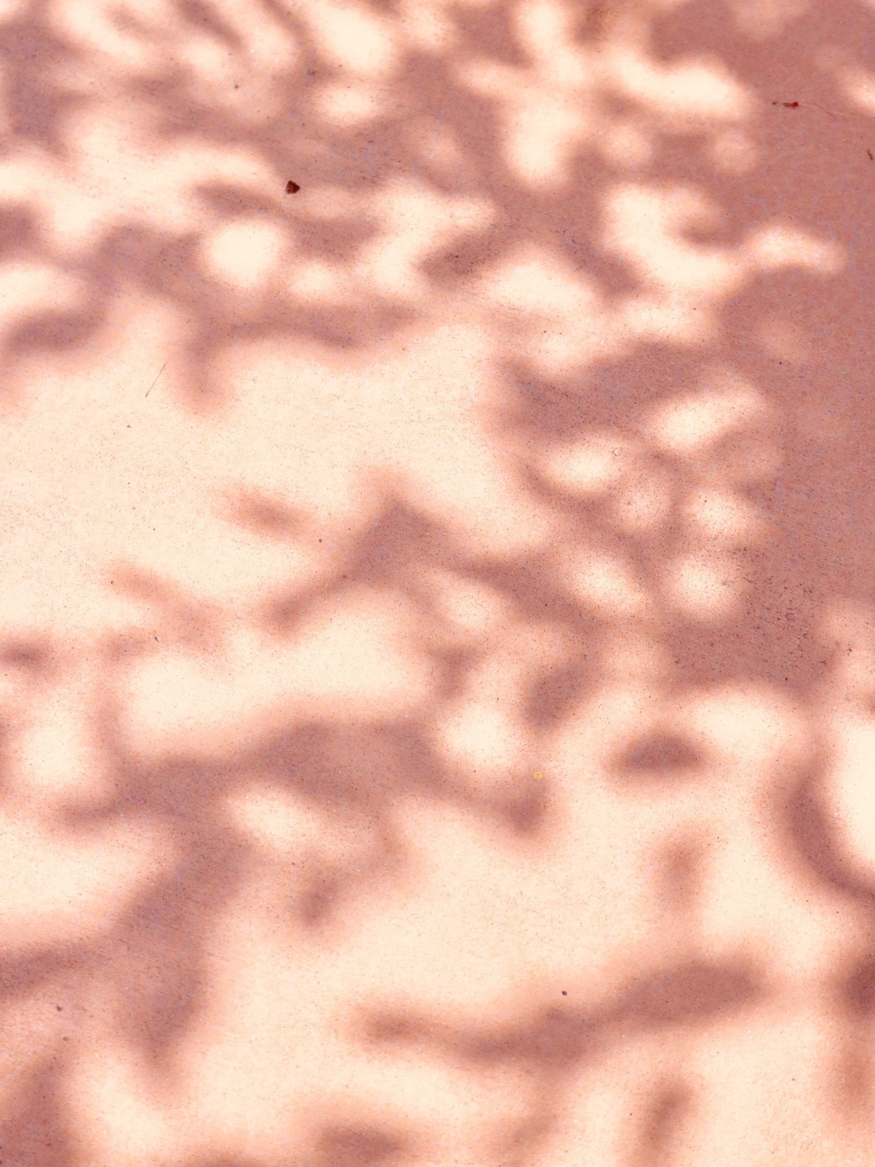
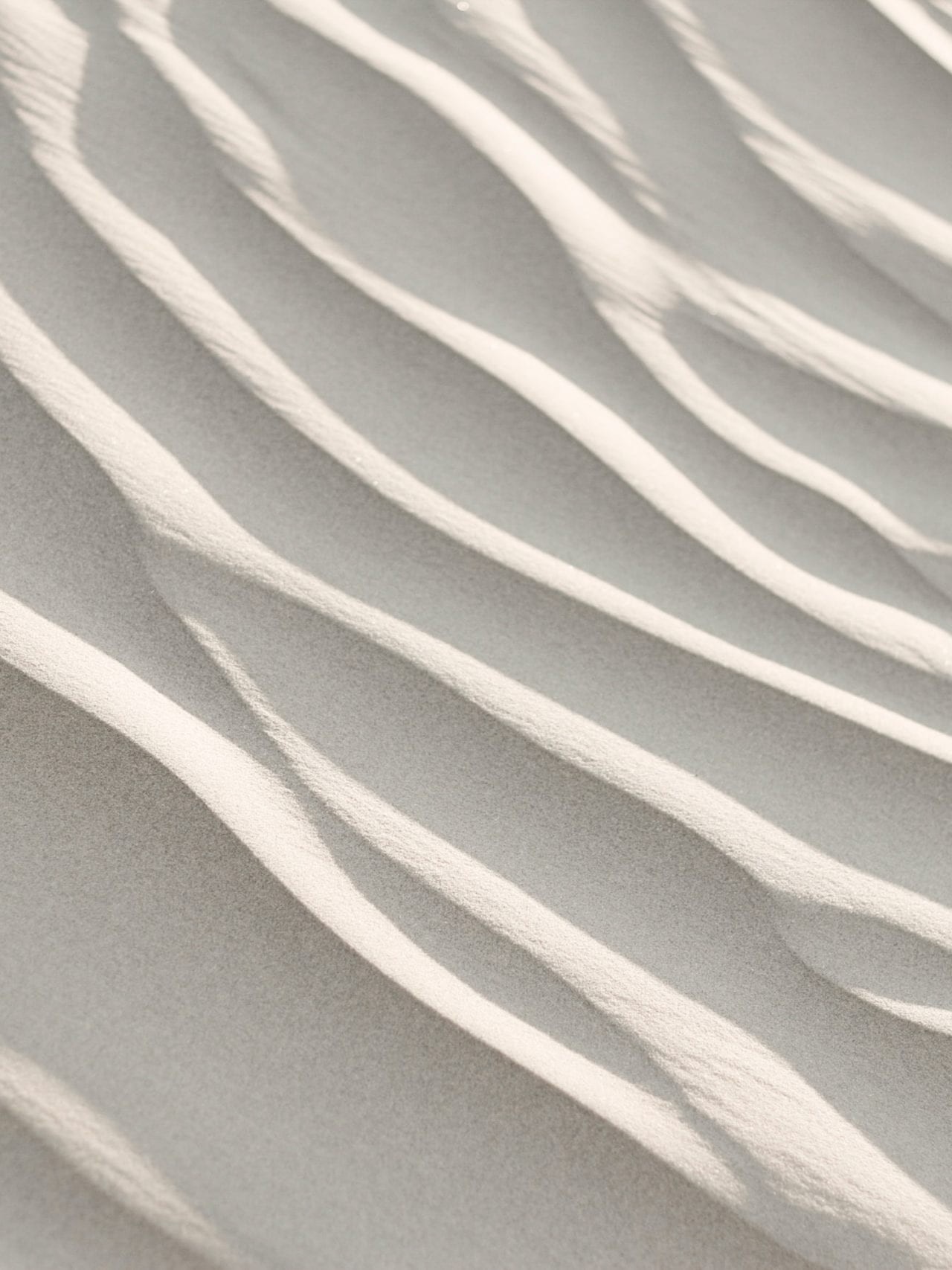
Combining a modern-neutral colour scheme and clean typography, the branding reflects daily moments of zen through nature’s scenes e.g. sand dunes and clouds.


Result
Freshness to wellness
We’re excited to have had the opportunity to challenge the perceptions around CBD through a simple, fresh take on branding within the personalised wellness space.
Other projects